Action Elements: Difference between revisions
From Smart LCD
mNo edit summary |
|||
| Line 1: | Line 1: | ||
== Touch_Key (TPK) Properties == | == Touch_Key (TPK) Properties == | ||
[[File:TPK.png|128x128px]] | |||
[[File:Properties Touch Key.png|right]] | [[File:Properties Touch Key.png|right]] | ||
'''General''' | '''General''' | ||
Show the basic information of the element | Show the basic information of the element | ||
| Line 83: | Line 83: | ||
== Virtual_Key (VPK) Properties == | == Virtual_Key (VPK) Properties == | ||
[[File:VPK.png|128x128px]] | |||
[[File:Properties Virtual Key.png|right]] | [[File:Properties Virtual Key.png|right]] | ||
'''General''' | '''General''' | ||
Show the basic information of the element | Show the basic information of the element | ||
| Line 123: | Line 123: | ||
== Swap_Page (SWP_PG) == | == Swap_Page (SWP_PG) == | ||
[[File:SWP-PG.png|128x128px]] | |||
[[File:Properties Swap Page.png|right]] | [[File:Properties Swap Page.png|right]] | ||
'''General''' | '''General''' | ||
Show the basic information of the element | Show the basic information of the element | ||
| Line 154: | Line 154: | ||
== TPK_Repeat (TPK_RPT) == | == TPK_Repeat (TPK_RPT) == | ||
[[File:TPK-RPT.png|128x128px]] | |||
[[File:Properties TPK Repeat.png|right|907x907px]] | [[File:Properties TPK Repeat.png|right|907x907px]] | ||
'''General''' | '''General''' | ||
Show the basic information of the element | Show the basic information of the element | ||
| Line 200: | Line 200: | ||
== TPK_Switch (TPK_SW) == | == TPK_Switch (TPK_SW) == | ||
[[File:TPK-SW.png|128x128px]] | |||
[[File:Properties TPK Switch.png|right|777x777px]] | [[File:Properties TPK Switch.png|right|777x777px]] | ||
'''General''' | '''General''' | ||
Show the basic information of the element | Show the basic information of the element | ||
| Line 238: | Line 238: | ||
== Slider (SDR) == | == Slider (SDR) == | ||
[[File:SDR.png|128x128px]] | |||
[[File:Properties Slider.png|right|766x766px]] | [[File:Properties Slider.png|right|766x766px]] | ||
'''General''' | '''General''' | ||
Show the basic information of the element | Show the basic information of the element | ||
| Line 277: | Line 277: | ||
== Slider_2 (SDR2) == | == Slider_2 (SDR2) == | ||
[[File:SDR2.png|128x128px]] | |||
[[File:Properties Slider2.png|right|724x724px]] | [[File:Properties Slider2.png|right|724x724px]] | ||
'''General''' | '''General''' | ||
Show the basic information of the element | Show the basic information of the element | ||
| Line 317: | Line 317: | ||
== Ring (RNG) == | == Ring (RNG) == | ||
[[File:RNG.png|128x128px]] | |||
[[File:Properties Ring.png|right|871x871px]] | [[File:Properties Ring.png|right|871x871px]] | ||
'''General''' | '''General''' | ||
Show the basic information of the element | Show the basic information of the element | ||
| Line 366: | Line 366: | ||
== Ring_2 (RNG2) == | == Ring_2 (RNG2) == | ||
[[File:RNG2.png|128x128px]] | |||
[[File:Properties Ring 2.png|right]] | [[File:Properties Ring 2.png|right]] | ||
'''General''' | '''General''' | ||
Show the basic information of the element | Show the basic information of the element | ||
Revision as of 10:41, 19 May 2025
Touch_Key (TPK) Properties
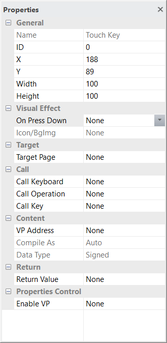
General
Show the basic information of the element
X and Y is the location of element on screen, reference point is element top-left corner
Width and Height are in pixels
top-left corner of the screen = 0,0
Visual Effect
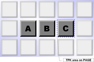
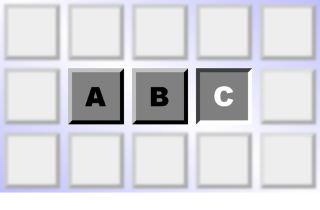
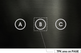
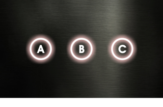
On Press Down options are  None / Inverse Color(*4) / Show Icon(*5) / Show Cropped BgImg(*6)
Icon/BgImg base on the above option, select a Background Image or an Icon for the visual effect
It can crop a box of a Background Image corresponding to the area.
Target
Target Page is for page jump function after touch
Call
Call Keyboard is for call up a keyboard after touch
Call Operation is for simple calculation after touch
Call Key is for building PIP_Keyboard
Content
VP Address is for calculation or Keyboard input result
Compile As can force VP variable work different than default (Auto);
VP_N16 (two successive VP_N16) work as VP_N32;
VP_N32 (first two byte of VP_N32) work as VP_N16;
VP_N64 (first two byte of VP_N64) work as VP_N16;
VP_N64 (first four byte of VP_N64) work as VP_N32
Data Type should be signed by default (*1)
Return
Return Value for select type of notification to host during touch.
It can notify the Host via Touch Key ID Response code (0x78) (*3): none / Up PGID + TPKID / PGID + TPKID / PGID + TPKID
none  no notification (by default);
Up PGID + TPKID, send on TPK release;
Down PGID + TPKID, send on TPK touch Down;
Up PGID + TPKID, send on TPK touch and release
Properties Control (advance feature)
Enable VP is none by default (element operate normally)
Select a VP for real time element control.
VP value will set to 1 as enable at power-on. It can be disabled (hidden) by a zero value
Note
*1. Please also see "TPK, VPK Call Functions" section for Call Features
*2. TPK support touch and move, action on release. It could change to "Touch-Key lock on touch" in "Project Setting".
*3. Please also see "Command" section for details
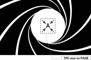
*4. TPK Visual Effect - Inverse Color
PAGE with Backgroud Image
|
Display Result (when touching TPK)
|
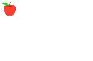
*5. TPK Visual Effect - Inverse Color
PAGE with Backgroudn Image
|
Backgroud Image for Visual Effect
|
Display Result (when touching TPK)
|
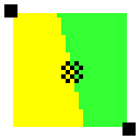
*.6 TPK Visual Effect - Show Icon
PAGE with Backgroudn Image
|
Icon for Visual Effect
|
Display Result (when touching TPK)
|
Virtual_Key (VPK) Properties
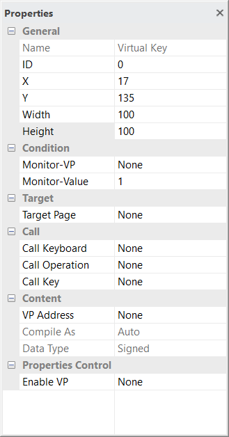
General
Show the basic information of the element
X and Y is the location of element on screen, reference point is element top-left corner
Width and Height are in pixels
top-left corner of the screen = 0,0
This element’s X, Y, Width, Height are not related to its functionality.
Condition
Monitor-VP is a VP to trigger this Virtual Key
Monitor-Value is the Value for trigging this element
Target
Target Page is for page jump function after touch
Call
Call Keyboard is for call up a keyboard after touch
Call Operation is for simple calculation after touch
Call Key is for building PIP_Keyboard
Content
VP Address is for calculation or Keyboard input result
Compile As can force VP variable work different than default (Auto)
VP_N16 (two successive VP_N16) work as VP_N32
VP_N32 (first two byte of VP_N32) work as VP_N16
VP_N64 (first two byte of VP_N64) work as VP_N16
VP_N64 (first four byte of VP_N64) work as VP_N32
Data Type should be signed by default (*1)
Properties Control (advance feature)
Enable VP is none by default (element operate normally)
Select a VP for real time element control.
VP value will set to 1 as enable at power-on. It can be disabled (hidden) by a zero value
Note:
*1. Please also see "TPK, VPK Call Functions" section for Call Features
*2. Floating point value could only operate with N32 (or Compile As N32) and PIP Number Keyboard
Swap_Page (SWP_PG)
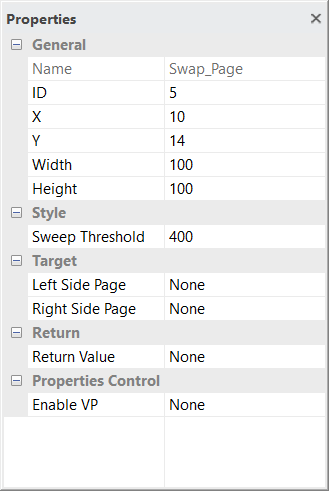
General
Show the basic information of the element
X and Y is the location of element on screen, reference point is element top-left corner
Width and Height are in pixels
top-left corner of the screen = 0,0
This element’s X, Y, Width, Height are not related to its functionality.
Style
Sweep Threshold defines the sweeping distance which start the feature
Smaller value makes it more easy to be trigger
Bigger value makes it slower response to the action
(Sweep should start on screen area without any other touch element)
Target
Left Side Page is the target page that pull-out form left side while the touch sweeping form left to right
Right Side Page is the target page that pull-out form right side while the touch sweeping form right to left
Return
Return Value for select type of notification to host during touch
It can notify the Host via Touch Key ID Response code (0x32)
none, no notification (by default) (see "Command" section for details)
Target PGID, send on sweep release
Properties Control (advance feature)
Enable VP is none by default (element operate normally)
Select a VP for real time element control.
VP value will set to 1 as enable at power-on. It can be disabled (hidden) by a zero value
TPK_Repeat (TPK_RPT)
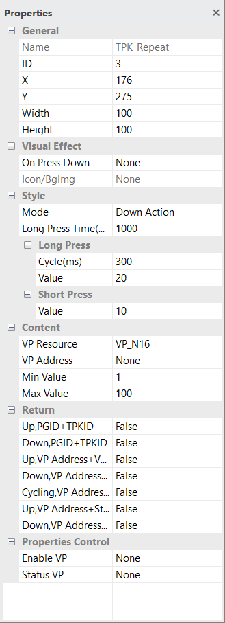
General
Show the basic information of the element
X and Y is the location of element on screen, reference point is element top-left corner
Width and Height are in pixels
top-left corner of the screen = 0,0
Visual Effect
On Press Down options are None / Inverse Color / Show Icon / Show Copped Image
Icon/BgImage base on the above option select a Background Image or an Icon for the visual effect
It can crop a box of a Background Image corresponding to the area.
Style
Mode is touch action moment
Down Action will trigger the Short Press feature while touch down
Up Action will trigger the Short Press feature while touch up
Long Press Time is the time for Long Press feature to be trigger
Long Press Cycle is the repeat action cycle time for long Press
Long Press Value is operation (VP:=VP+value) value for Long Press
Short Press Value is the operation (VP:=VP+value) value for Short Press
(negative value for minus operation)
Content
VP Resource is the type of VP to be used
VP Address is the VP for the operation
Min Value is the bottom value that will be limited by the operation
Max Value is the top value that will be limited by the operation
Return
Value, VP and Status VP can be  (multiply) sent to host as notification
Return Value
Up, PGID+TPKID / Down, PGID+TPKID
Return VP
Up, VP Address+Value / Down, VP Address+Value / Cycling, VP Address+Value
Return Status VP
Up, Vp Address+Status Value / Down, Vp Address+Status Value
Properties Control (advance feature)
Enable VP is none by default (element operate normally)
Select a VP for real time element control.
VP value will set to 1 as enable at power-on. It can be disabled (hidden) by a zero value
Status VP is none by default
Select a VP for storing the real time status (0=no touch, 1=touch down, 2= long press)
TPK_Switch (TPK_SW)
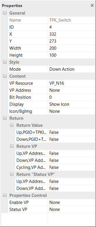
General
Show the basic information of the element
X and Y is the location of element on screen, reference point is element top-left corner
Width and Height are in pixels
top-left corner of the screen = 0,0
Style
Mode is touch action moment
Down Action will trigger the Short Press feature while touch down
Up Action will trigger the Short Press feature while touch up
Content
VP Resource is the type of VP to be used
VP Address is the VP for the operation
Bit Position is the bit to be triggered (inversed) in the VP address
Display options are Show Icon or Show Copped Image
Icon/BgImage base on the above option select a Background Image or an Icon for the visual effect.
It can crop a box of a Background Image corresponding to the area.
Return
Value, VP and Status VP can be  (multiply) sent to host as notification
Return Value
Up, PGID+TPKID / Down, PGID+TPKID
Return VP
Up, VP Address+Value / Down, VP Address+Value / Cycling, VP Address+Value
Return Status VP
Up, Vp Address+Status Value / Down, Vp Address+Status Value
Properties Control (advance feature)
Enable VP is none by default (element operate normally)
Select a VP for real time element control.
VP value will set to 1 as enable at power-on. It can be disabled (hidden) by a zero value
Status VP is none by default
Select a VP for storing the real time status (0=no touch, 1=touch down)
Slider (SDR)
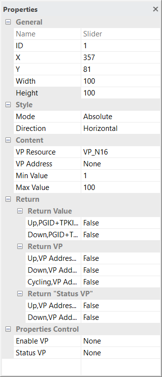
General
Show the basic information of the element
X and Y is the location of element on screen, reference point is element top-left corner
Width and Height are in pixels
top-left corner of the screen = 0,0
Style
Mode is touch action way
Absolute=give the value direct proportion to the element area
Relative=give more fine value by multiple sliding action
Direction is for the slider sense direction
Horizontal=horizontal sliding
Vertical=vertical sliding
Content
VP Resource is the type of VP to be used
VP Address is the VP for the operation
Min Value is the bottom value that will be limited by the operation
Max Value is the top value that will be limited by the operation
Return
Value, VP and Status VP can be (multiply) sent to host as notification
Return Value
Up, PGID+TPKID / Down, PGID+TPKID
Return VP
Up, VP Address+Value / Down, VP Address+Value / Cycling, VP Address+Value
Return Status VP
Up, Vp Address+Status Value / Down, Vp Address+Status Value
Properties Control (advance feature)
Enable VP is none by default (element operate normally)
Select a VP for real time element control.
VP value will set to 1 as enable at power-on. It can be disabled (hidden) by a zero value
Status VP is none by default
Select a VP for storing the real time status (0=no touch, 1=touch down)
Slider_2 (SDR2)
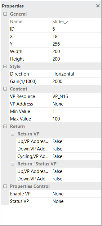
General
Show the basic information of the element
X and Y is the location of element on screen, reference point is element top-left corner
Width and Height are in pixels
top-left corner of the screen = 0,0
Style
Direction is for the two pint sliding sense direction
Horizontal=horizontal sliding
Vertical=vertical sliding
Gain defines the two pint sliding amplification
Smaller value make the move-to-value gain less
Bigger value make the move-to-value gain more
(Sweep should start on screen area without any other touch element)
Content
VP Resource is the type of VP to be used
VP Address is the VP for the operation
Min Value is the bottom value that will be limited by the operation
Max Value is the top value that will be limited by the operation
Return
Value, VP and Status VP can be (multiply) sent to host as notification
Return Value
Up, PGID+TPKID / Down, PGID+TPKID
Return VP
Up, VP Address+Value / Down, VP Address+Value / Cycling, VP Address+Value
Return Status VP
Up, Vp Address+Status Value / Down, Vp Address+Status Value
Properties Control (advance feature)
Enable VP is none by default (element operate normally)
Select a VP for real time element control.
VP value will set to 1 as enable at power-on. It can be disabled (hidden) by a zero value
Status VP is none by default
Select a VP for storing the real time status (0=no touch, 1=touch down)
Ring (RNG)
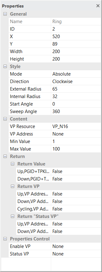
General
Show the basic information of the element
X and Y is the location of element on screen, reference point is element top-left corner
Width and Height are in pixels
top-left corner of the screen = 0,0
Style
Mode is touch action way
Absolute=give the value direct proportion to the element area
Direction is for the slider direction Clockwise or Counterclockwise
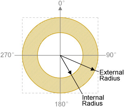
External Radius define the outer boundary of the sensing ring (*1)
Internal Radius define the inner boundary of the sensing ring (*1)
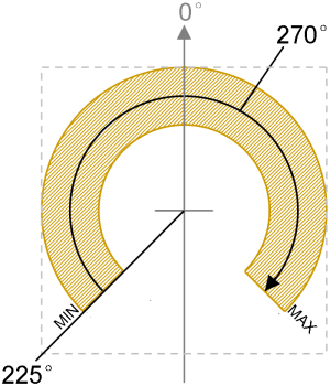
Start Angle is the angular location of the min value (*2)
Sweep Angle is the effective angular area that relatively begin form the Start Angle for sensing (*2)
(the above 4 value define the boundary of the sensing area)
Content
VP Resource is the type of VP to be used
VP Address is the VP for the operation
Min Value is the bottom value that will be limited by the operation
Max Value is the top value that will be limited by the operation
Return
Value, VP and Status VP can be (multiply) sent to host as notification
Return Value
Up, PGID+TPKID / Down, PGID+TPKID
Return VP
Up, VP Address+Value / Down, VP Address+Value / Cycling, VP Address+Value
Return Status VP
Up, Vp Address+Status Value / Down, Vp Address+Status Value
Properties Control (advance feature)
Enable VP is none by default (element operate normally)
Select a VP for real time element control.
VP value will set to 1 as enable at power-on. It can be disabled (hidden) by a zero value
Status VP is none by default
Select a VP for storing the real time status (0=no touch, 1=touch down)
note:
| *1. Definition of Radius and Angle | *2. example: Direction = Clockwise; Start Angle = 255°; Sweep Angle = 270 |
|
|
|---|
Ring_2 (RNG2)
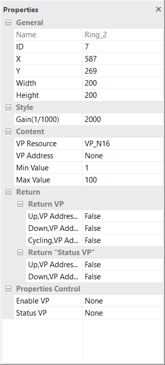
General
Show the basic information of the element
X and Y is the location of element on screen, reference point is element top-left corner
Width and Height are in pixels
top-left corner of the screen = 0,0
Style
Gain defines the two pint sliding amplification
Smaller value make the move-to-value gain less
Bigger value make the move-to-value gain more
(touch should start on screen area without any other touch element)
Content
VP Resource is the type of VP to be used
VP Address is the VP for the operation
Min Value is the bottom value that will be limited by the operation
Max Value is the top value that will be limited by the operation
Return
Value, VP and Status VP can be (multiply) sent to host as notification
Return VP
Up, VP Address+Value / Down, VP Address+Value / Cycling, VP Address+Value
Return Status VP
Up, Vp Address+Status Value / Down, Vp Address+Status Value
Properties Control (advance feature)
Enable VP is none by default (element operate normally)
Select a VP for real time element control.
VP value will set to 1 as enable at power-on. It can be disabled (hidden) by a zero value
Status VP is none by default
Select a VP for storing the real time status (0=no touch, 1=touch down)

