Graphics Elements: Difference between revisions
| (26 intermediate revisions by the same user not shown) | |||
| Line 1: | Line 1: | ||
== Tachometer | == Tachometer - Hand Mode (HND) == | ||
[[File:HND.png|128x128px]] | [[File:HND.png|128x128px]] | ||
[[File:Properties TCM HAND.png|right]] | [[File:Properties TCM HAND.png|right]] | ||
| Line 52: | Line 52: | ||
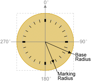
<nowiki>*</nowiki>1. Radius and Angle Definition | <nowiki>*</nowiki>1. Radius and Angle Definition | ||
[[File:TCM HAND NOTE01.png|320x320px]] | [[File:TCM HAND NOTE01.png|320x320px]] | ||
== Tachometer - (Pseudo) Icon Mode (TCM) == | |||
[[File:Properties TCM Icon.png|right|778x778px]] | |||
[[File:TCM.png|128x128px]] | |||
'''General''' | |||
Show the basic information of the element | |||
<u>X</u> and <u>Y</u> is the location of element on screen, reference point is element top-left corner | |||
<u>Width</u> and <u>Height</u> are in pixels | |||
top-left corner of the screen = 0,0 | |||
'''Style''' | |||
<u>Mode</u> options are Hand / Donut Mix Color / Donut Discolor / Icon Rotation / Icon Open / Pseudo Icon Rotation / Pseudo Icon Open | |||
<u>Direction</u> options Clockwise / CounterClockwise | |||
<u>Start Angle</u> is the angular location of the min value | |||
<u>Sweep Angle</u> is the effective angular area that relatively begin form the Start Angle for sensing | |||
'''Foreground''' | |||
<u>Icon</u> select an icon to be rotate | |||
<u>Transparent</u> = False by default | |||
True: enable transparent effect to show the IMG_ICO | |||
Auto: enable transparent effect and pick a high possible color as Transparent color | |||
<u>Transparent Color</u> assign one color in the IMG_ICO that show as transparent | |||
suggested to use pure color for transparent effect (e.g. pure-magenta pure-black, pure-white, etc…) | |||
<u>Icon Center</u> options are Auto / Advance | |||
<u>Icon Center X, Y</u> define the the icon rotation reference | |||
'''Rotation Center Point''' | |||
<u>Rotation Center</u> could be Icon Center (auto select) or by manual | |||
<u>Rotation Center X, Y</u> define the the rotation reference point | |||
'''Content''' | |||
<u>VP Resource</u> is the type of VP to be used | |||
<u>VP Address</u> is the VP for the operation | |||
<u>Min Value</u> is the bottom value that can be shown | |||
(value smaller than this value will hide the tachometer) | |||
<u>Max Value</u> is the top value that can be shown | |||
(value bigger than this value will hide the tachometer) | |||
'''Properties Control (advance feature)''' | |||
<u>Enable VP</u> is none by default (element operate normally) | |||
Select a VP for real time element control. | |||
VP value will set to 1 as enable at power-on. It can be disabled (hidden) by a zero value | |||
<u>Transparent color VP</u> is none by default (using the above selected color) | |||
Select a VP for real time transparent color change. VP value will copy the above selected color at power-on. | |||
<u>Transparent VP</u> is none by default (using the above option) | |||
Select a VP for real time transparent background control. VP value will copy the above transparent config at power-on. | |||
It can be enabled by a non-zero value or disable by a zero | |||
<u>Icon VP</u> is none by default (using the above selected font) | |||
Select a VP for real time IMG_ICON change. VP value will copy the above IMG_ICO ID at power-on. | |||
'''Preview''' | |||
Preview Value is only for displaying text in SGTools environment | |||
'''Note''' | |||
<nowiki>*</nowiki>1 Pseudo Icon Mode is similar to Icon Mode. It shows the Icon that pre-combined with background. | |||
<nowiki>*</nowiki>2 Pseudo Icon Mode is similar to Icon Open Mode. It shows the Icon angle section that pre-combined with background | |||
<nowiki>*</nowiki>3 Tachometer - Pseudo Icon Mode operation idea | |||
Mode=Pseudo Icon Rotation; Transparent=True; Transparent Color=000000; | |||
Direction=Clockwise; Start Angle=225; Sweep Angle=270; Min Value=0; Max Value=17; | |||
{| | |||
!Background Image | |||
!Foreground Image | |||
!Angles | |||
|- | |||
|[[File:TCM Icon NOTE01 back.png|180x180px]] | |||
|[[File:TCM Icon NOTE01 pointer.png|180x180px]] | |||
|[[File:TCM Icon NOTE01 center.png|250x250px]] | |||
|} | |||
Display result | |||
VP value = 00~08 [[File:TCM Icon NOTE01 00 08.png|640x640px]] | |||
VP value = 09~17 [[File:TCM Icon NOTE01 09 17.png|640x640px]] | |||
<nowiki>*</nowiki>4 Tachometer - Pseudo Icon Open Mode operation idea | |||
Mode=Pseudo Icon Open; Transparent=True; Transparent Color=000000; | |||
Direction=Clockwise; Start Angle=270; Sweep Angle=180; Min Value=0; Max Value=14; | |||
{| | |||
!Background Image | |||
!Foreground Image | |||
!Angles | |||
|- | |||
|[[File:TCM Icon NOTE02 back.png|200x200px]] | |||
|[[File:TCM Icon NOTE02 foreground.png|200x200px]] | |||
|[[File:TCM Icon NOTE02 center.png|250x250px]] | |||
|} | |||
Display result | |||
VP value = 00~04 [[File:TCM Icon NOTE02 00 04.png|640x640px]] | |||
VP value = 05~09 [[File:TCM Icon NOTE02 05~09.png|640x640px]] | |||
VP value = 10~14 [[File:TCM Icon NOTE02 09 14.png|640x640px]] | |||
== Tachometer - Donut Mode (R16, R32) == | |||
[[File:R16.png|128x128px]] | |||
[[File:Properties TCM Donut.png|right|735x735px]] | |||
'''General''' | |||
Show the basic information of the element | |||
<u>X</u> and <u>Y</u> is the location of element on screen, reference point is element top-left corner | |||
<u>Width</u> and <u>Height</u> are in pixels | |||
top-left corner of the screen = 0,0 | |||
'''Style''' | |||
<u>Mode</u> options are Hand / Donut Mix Color / Donut Discolor / Icon Rotation / Icon Open / Pseudo Icon Rotation / Pseudo Icon Open | |||
<u>Direction</u> options Clockwise / CounterClockwise | |||
<u>Start Angle</u> is the angular location of the min value | |||
<u>Sweep Angle</u> is the effective angular area that relatively begin form the Start Angle for sensing | |||
'''Background''' | |||
<u>Show Base Color</u> show the Donut shape background even at min value | |||
(in Mix Color Mode, Background color is the Gap color) | |||
<u>Base Color</u> is the Donut background color | |||
(Mix Color Mode, Background color is the Gap color) | |||
<u>Internal Radius</u> define the middle hole of the Donut | |||
<u>Edge Width</u> can selected as an outline over the Donut | |||
'''Foreground''' | |||
<u>Step Width</u> is for adjust display Levels color size | |||
<u>Gap Width</u> is for adjust the display Levels color gap which show Base Color | |||
<u>No.Of Levels</u> | |||
2 for Donut Mix Color Mode show a gradient mix of two color | |||
3-26 for Donut Discolor Mode change the whole donut color w.r.t. VP value | |||
'''Rotation Center''' | |||
<u>Rotation Center</u> could be Icon Center (auto select) or by manual | |||
<u>Rotation Center X</u>, <u>Rotation Center Y</u> define the is the rotation reference point | |||
'''Content''' | |||
<u>VP Resource</u> is the type of VP hold the content (VP_N16 by default) | |||
<u>VP Address</u> is the VP that hold the value | |||
<u>Min Value</u> is the minimum tachometer value to be show (value smaller than this value will hide the tachometer) | |||
<u>Max Value</u> is the maximum tachometer value to be show (value bigger than this value will hide the tachometer) | |||
'''Properties Control (advance feature)''' | |||
<u>Enable VP</u> is none by default (element operate normally) | |||
Select a VP for real time element control. | |||
VP value will set to 1 as enable at power-on. It can be disabled (hidden) by a zero value. | |||
<u>Color Array VP</u> is for changing the color for visual effect | |||
VP value will copy the above selected Color at power-on. | |||
'''Preview''' | |||
<u>Preview Value</u> is only for displaying text in SGTools environment | |||
'''Note''' | |||
{| | |||
|*1. Definition of Radius and Angle | |||
|*2. example: <u>Direction</u> = Clockwise; <u>Start Angle</u> = 255°; <u>Sweep Angle</u> = 270 | |||
|- | |||
![[File:Ring definition.png|320x320px]] | |||
![[File:Ring swap example.png|268x268px]] | |||
|} | |||
<nowiki>*</nowiki>3. Donut Mix Color Mode example | |||
[[File:TCM Donut note03.png|640x640px]] | |||
<nowiki>*</nowiki>4. Donut Discolor Mode example | |||
[[File:TCM Donut note04.png|640x640px]] | |||
== Progress Bar (B16, B32) == | |||
[[File:B16.png|128x128px]] | |||
[[File:Properties BAR.png|right|662x662px]] | |||
'''General''' | |||
Show the basic information of the element | |||
<u>X</u> and <u>Y</u> is the location of element on screen, reference point is element top-left corner | |||
<u>Width</u> and <u>Height</u> are in pixels | |||
top-left corner of the screen = 0,0 | |||
'''Style''' | |||
<u>Mode</u> options are | |||
Color Mode, longer color bar could be show with a no. close to max (bar color could also be a mix of Forecolor1 & 2) | |||
Icon Mode, Icon will move to the far end with a no. close to max | |||
Fill Icon Mode, bar color could be replaced by an IMG_ICO | |||
<u>Direction</u> options are | |||
L->R / R->L / Up->Dn / Dn->Up | |||
<u>Forecolor1</u> Progress start color | |||
<u>Forecolor2</u> Progress end color | |||
<u>Transparent</u> | |||
False by default | |||
True: enable transparent effect to show the IMG_ICO | |||
<u>Gap/Transparent Color</u> function depends on mode selected | |||
In Fill Color Mode, the selected color is gap color in the Progress Bar | |||
In Icon Mode with Transparent Enabled, the selected color in the IMG_ICO will show as transparent. | |||
(it is suggested to use pure color for transparent effect)(e.g. pure-magenta pure-black, pure-white, etc…) | |||
<u>Gap Width</u> is in pixel for gap in the bar | |||
<u>Step Width</u> is in pixel for the distance between gap | |||
'''Content''' | |||
<u>VP Resource</u> is the type of VP hold the content (VP_N16 by default) | |||
<u>VP Address</u> is the VP that hold the value | |||
<u>Icon</u> for Move Icon mode or Fill Icon mode | |||
<u>Min Value</u> is the minimum Progress Bar value | |||
<u>Max Value</u> is the maximum Progress Bar value | |||
'''Properties Control (advance feature)''' | |||
<u>Enable VP</u> is none by default (element operate normally) | |||
Select a VP for real time element control. VP value will set to 1 as enable at power-on. It can be disabled (hidden) by a zero value | |||
<u>Foreground color1 VP</u> is none by default (using the above selected color) | |||
Select a VP for real time color change | |||
VP value will copy the above selected color at power-on. | |||
<u>Foreground color2 VP</u> is none by default (using the above selected color) | |||
Select a VP for real time color change | |||
VP value will copy the above selected color at power-on. | |||
<u>Transparent color VP</u> is none by default (using the above selected color) | |||
Select a VP for real time transparent color change | |||
VP value will copy the above selected color at power-on. | |||
<u>Transparent VP</u> is none by default (using the above option) | |||
Select a VP for real time transparent background control VP value will copy the above transparent config at power-on. It can be enabled by a non-zero value or disable by a zero | |||
<u>ICON VP</u> is none by default (using the above selected font) | |||
Select a VP for real time change the IMG_ICO ID | |||
VP value will copy the above ID at power-on. | |||
'''Preview''' | |||
<u>Preview Value</u> is only for displaying text in SGTools environment | |||
'''note''' | |||
<nowiki>*</nowiki>1. Progress Bar Operating Mode (Dn-->Up) Idea | |||
{| | |||
!Color Mode | |||
(100%, 60%) | |||
! colspan="2" |Fill Icon Mode | |||
(100%, 60%) | |||
!Icon Mode | |||
(100%, 60%, 0%) | |||
|- | |||
|[[File:BAR NOTE01 COLOR.png|300x300px]] | |||
| colspan="2" |[[File:BAR NOTE01 FILL ICON.png|300x300px]] | |||
|[[File:BAR NOTE01 ICON.png|300x300px]] | |||
|} | |||
== Graph Element (G16) == | |||
[[File:Properties G16.png|right|541x541px]] | |||
[[File:G16.png|128x128px]] | |||
'''General''' | |||
Show the basic information of the element | |||
<u>X</u> and <u>Y</u> is the location of element on screen, reference point is element top-left corner | |||
<u>Width</u> and <u>Height</u> are in pixels | |||
top-left corner of the screen = 0,0 | |||
'''Style''' | |||
<u>Foreground Color</u> is the color for of graph | |||
'''Format''' | |||
<u>Plot Type</u> options are | |||
Dot, plot data as dot; | |||
Line, plot data and link with line | |||
Area, fill betwen plot and X-axis | |||
Top Fill, fill between plot and Max Value | |||
Bottom Fill, fill between plot and Min Value | |||
<u>Dot Width</u> options are 1 / 2 / 3 / 4 pixels | |||
(may resize the element width) | |||
<u>Dot Height</u> options are 1 / 2 / 3 / 4 pixels | |||
(may resize the element height) | |||
'''Content''' | |||
<u>VP Graph</u> select a VP_G16 array to be port on screen | |||
<u>Min Value</u> is minimal graph potting value | |||
<u>Max Value</u> is maximum graph potting value | |||
'''Properties Control (advance feature)''' | |||
<u>Enable VP</u> is none by default (element operate normally) | |||
Select a VP for real time element control. VP value will set to 1 as enable at power-on. It can be disabled (hidden) by a zero value | |||
<u>Foreground color VP</u> is none by default (using the above selected color) | |||
Select a VP for real time color change | |||
VP value will copy the above selected color at power-on. | |||
<u>Ymin VP</u> is none by default (using the above selected color) | |||
Select a VP for real time graph Min Value for Y scale zoom or pan | |||
VP value will copy the above selected color at power-on. | |||
<u>Ymax VP</u> is none by default (using the above selected color) | |||
Select a VP for real time graph Max Value for Y scale zoom or pan | |||
VP value will copy the above selected color at power-on. | |||
<u>Rule1 VP</u> is none by default | |||
Select a VP for real time horizontal line to be show in graph | |||
<u>Rule2 VP</u> is none by default | |||
Select a VP for another real time horizontal line to be show in graph | |||
== Bitmap Element (BP1) == | |||
[[File:Properties BP1.png|right|391x391px]] | |||
[[File:BP1.png|128x128px]] | |||
'''General''' | |||
Show the basic information of the element | |||
<u>X</u> and <u>Y</u> is the location of element on screen, reference point is element top-left corner | |||
<u>Width</u> and <u>Height</u> are in pixels | |||
top-left corner of the screen = 0,0 | |||
'''Style''' | |||
<u>Foreground Color(1)</u> is the color for "1" bits | |||
<u>Background Color(0)</u> is the color for "0" bits | |||
<u>Show Type</u> options are | |||
Show all (default) show all Foreground and Background Color | |||
Show Foreground only show the "1" bits' color | |||
Show Background only show the "0" bits' color | |||
'''Content''' | |||
<u>VP Bitmap</u> select a VP_BP1 array for the 1bpp graph data | |||
'''Properties Control (advance feature)''' | |||
<u>Enable VP</u> is none by default (element operate normally) | |||
Select a VP for real time element control. VP value will set to 1 as enable at power-on. It can be disabled (hidden) by a zero value | |||
<u>Foreground color VP</u> is none by default (using the above selected color) | |||
Select a VP for real time color change | |||
VP value will copy the above selected color at power-on. | |||
<u>Background color VP</u> is none by default (using the above selected color) | |||
Select a VP for real time color change | |||
VP value will copy the above selected color at power-on. | |||
<u>Show Type VP</u> is none by default (using the Show Type) | |||
Select a VP for real time Show Type change | |||
0(Show all) / 1(Show Foreground only) / 2(Show Background only) | |||
VP value will copy the above selected Show Type at power-on | |||
== Round Clock (CLK_R) == | |||
[[File:CLK-R.png|128x128px]] | |||
[[File:Properties CKL R.png|right|775x775px]] | |||
'''General''' | |||
Show the basic information of the element | |||
<u>X</u> and <u>Y</u> is the location of element on screen, reference point is element top-left corner | |||
<u>Width</u> and <u>Height</u> are in pixels | |||
top-left corner of the screen = 0,0 | |||
'''Style''' | |||
<u>Mode</u> options are Hand / Icon Rotation | |||
<u>Transparent</u> False for showing clock face background color | |||
<u>Background Color</u> clock face color | |||
<u>Face</u> True for generate clock face and markings | |||
'''Face''' | |||
<u>Line Color</u>, <u>Line Width</u> are clock outer circle color and line width | |||
<u>Major Marking Color</u>, <u>Major Marking Width</u> are clock hour mark color and line width | |||
<u>Minor Marking Color</u>, <u>Minor Marking Width</u> are clock minutes mark color and line width | |||
<u>Font</u>, <u>Font Color</u> are clock mark numbers font and color | |||
'''Hands''' | |||
<u>Hands Type</u> options are Line / Quadrangle / Trangle | |||
<u>Hour Hand Color</u>, <u>Minute Hand Color</u>, <u>Second Hand Color</u>, <u>Center Mark Color</u> are color of hands and the color of its center | |||
'''Properties Control (advance feature)''' | |||
<u>Enable VP</u> is none by default (element operate normally) | |||
Select a VP for real time element control. VP value will set to 1 as enable at power-on. It can be disabled (hidden) by a zero value | |||
<u>Transparent VP</u> is none by default (using the above selected) | |||
Select a VP for real time Transparent change (1=true, 0=false) | |||
VP value will copy the above selected at power-on. | |||
<u>Hands Type</u> is none by default (using the above selected) | |||
Select a VP for real time hand config change | |||
(0=Line, 1=Quadrangle, 2=TrangleHands) | |||
VP value will copy the above selected at power-on. | |||
<u>Color VPs</u>, is none by default (using the above selected color) | |||
Select a VP for real time color change | |||
VP value will copy the above selected at power-on. | |||
== QR Code Element (QRC) == | |||
[[File:QRC.png|128x128px]] | |||
[[File:Properties QRC.png|right|432x432px]] | |||
'''General''' | |||
Show the basic information of the element | |||
<u>X</u> and <u>Y</u> is the location of element on screen, reference point is element top-left corner | |||
<u>Width</u> and <u>Height</u> are in pixels | |||
top-left corner of the screen = 0,0 | |||
'''Style''' | |||
<u>Scale</u> define the dot size of the QR code | |||
'''Format''' | |||
<u>Size</u> define matrix size and the capacity of the QR code | |||
[[File:QRC size options.png|161x161px]] | |||
'''Content''' | |||
<u>VP Resource</u> QR code need string data to be generate, VP_N16, VP_STR can be used | |||
<u>VP Address</u> is the VP that hold the string | |||
'''Properties Control (advance feature)''' | |||
<u>Enable VP</u> is none by default (element operate normally) | |||
Select a VP for real time element control. VP value will set to 1 as enable at power-on. | |||
It can be disabled (hidden) by a zero value | |||
'''Preview''' | |||
<u>Preview Value</u> is only for displaying text in SGTools environment | |||
== Draw Pad (DPD) == | |||
[[File:DPD.png|128x128px]] | |||
[[File:Properties DPD.png|right|329x329px]] | |||
'''General''' | |||
Show the basic information of the element | |||
<u>X</u> and <u>Y</u> is the location of element on screen, reference point is element top-left corner | |||
<u>Width</u> and <u>Height</u> are in pixels | |||
top-left corner of the screen = 0,0 | |||
'''Content''' | |||
<u>VP Resource</u> Draw Pad need a series of VP_N16 to draw | |||
<u>VP Address</u> is the first VP that hold the draw code | |||
'''Properties Control (advance feature)''' | |||
<u>Enable VP</u> is none by default (element operate normally) | |||
Select a VP for real time element control. VP value will set to 1 as enable at power-on. | |||
It can be disabled (hidden) by a zero value | |||
Latest revision as of 17:53, 30 May 2025
Tachometer - Hand Mode (HND)

General
Show the basic information of the element
X and Y is the location of element on screen, reference point is element top-left corner
Width and Height are in pixels
top-left corner of the screen = 0,0
Style
Mode options are Hand / Donut Mix Color / Donut Discolor / Icon Rotation / Icon Open / Pseudo Icon Rotation / Pseudo Icon Open
Direction options Clockwise / CounterClockwise
Start Angle is the angular location of the min value
Sweep Angle is the effective angular area that relatively begin form the Start Angle for sensing
Background
Marking & Label Enable can generate the meter face details
Base Color, Label, Minor Marking can be enable and define at here
Label Min Value and Label Max Value is for meter face display only.
It show beside the Major Marking
Foreground
Hands Type options are Line / Quadrangle / Trangle
Hands Color is for the pointer hand color
Center Mark Color is color at the center of the meter
Rotation Center Point
Rotation Center options are Auto / Advance
Rotation Center X, Y define the the rotation reference point
Content
VP Resource is the type of VP to be used
VP Address is the VP for the operation
Min Value is the bottom value that can be shown
(value smaller than this value will stop at the min location)
Max Value is the top value that can be shown
(value larger than this value will stop at the max location)
Properties Control (advance feature)
Enable VP is none by default (element operate normally)
Select a VP for real time element control.
VP value will set to 1 as enable at power-on. It can be disabled (hidden) by a zero value
Base Color VP, Hands Color VP, Center Mark Color VP, Major Marking Color VP, Minor Marking Color VP and Label Color VP are none by default (using the above selected color)
Select a VP for real time base color adjustment
VP value will copy the above selected color at power-on
Hands Type VP, is none by default (using the above selected color)
Select a VP for real time base color adjustment
VP value will copy the above selected color at power-on
Preview
Preview Value is only for displaying text in SGTools environment
Note
*1. Radius and Angle Definition
Tachometer - (Pseudo) Icon Mode (TCM)
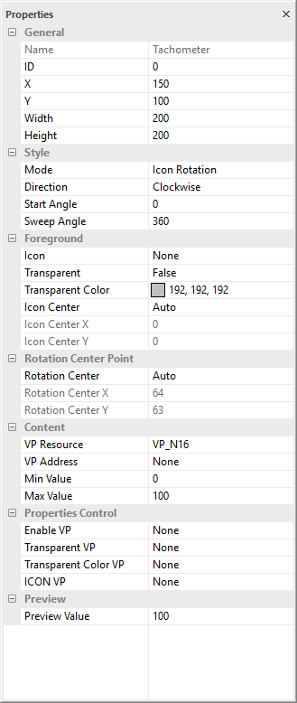
General
Show the basic information of the element
X and Y is the location of element on screen, reference point is element top-left corner
Width and Height are in pixels
top-left corner of the screen = 0,0
Style
Mode options are Hand / Donut Mix Color / Donut Discolor / Icon Rotation / Icon Open / Pseudo Icon Rotation / Pseudo Icon Open
Direction options Clockwise / CounterClockwise
Start Angle is the angular location of the min value
Sweep Angle is the effective angular area that relatively begin form the Start Angle for sensing
Foreground
Icon select an icon to be rotate
Transparent = False by default
True: enable transparent effect to show the IMG_ICO
Auto: enable transparent effect and pick a high possible color as Transparent color
Transparent Color assign one color in the IMG_ICO that show as transparent
suggested to use pure color for transparent effect (e.g. pure-magenta pure-black, pure-white, etc…)
Icon Center options are Auto / Advance
Icon Center X, Y define the the icon rotation reference
Rotation Center Point
Rotation Center could be Icon Center (auto select) or by manual
Rotation Center X, Y define the the rotation reference point
Content
VP Resource is the type of VP to be used
VP Address is the VP for the operation
Min Value is the bottom value that can be shown
(value smaller than this value will hide the tachometer)
Max Value is the top value that can be shown
(value bigger than this value will hide the tachometer)
Properties Control (advance feature)
Enable VP is none by default (element operate normally)
Select a VP for real time element control.
VP value will set to 1 as enable at power-on. It can be disabled (hidden) by a zero value
Transparent color VP is none by default (using the above selected color)
Select a VP for real time transparent color change. VP value will copy the above selected color at power-on.
Transparent VP is none by default (using the above option)
Select a VP for real time transparent background control. VP value will copy the above transparent config at power-on.
It can be enabled by a non-zero value or disable by a zero
Icon VP is none by default (using the above selected font)
Select a VP for real time IMG_ICON change. VP value will copy the above IMG_ICO ID at power-on.
Preview
Preview Value is only for displaying text in SGTools environment
Note
*1 Pseudo Icon Mode is similar to Icon Mode. It shows the Icon that pre-combined with background.
*2 Pseudo Icon Mode is similar to Icon Open Mode. It shows the Icon angle section that pre-combined with background
*3 Tachometer - Pseudo Icon Mode operation idea
Mode=Pseudo Icon Rotation; Transparent=True; Transparent Color=000000;
Direction=Clockwise; Start Angle=225; Sweep Angle=270; Min Value=0; Max Value=17;
| Background Image | Foreground Image | Angles |
|---|---|---|
Display result
*4 Tachometer - Pseudo Icon Open Mode operation idea
Mode=Pseudo Icon Open; Transparent=True; Transparent Color=000000;
Direction=Clockwise; Start Angle=270; Sweep Angle=180; Min Value=0; Max Value=14;
| Background Image | Foreground Image | Angles |
|---|---|---|
Display result
Tachometer - Donut Mode (R16, R32)
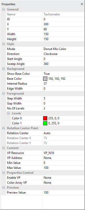
General
Show the basic information of the element
X and Y is the location of element on screen, reference point is element top-left corner
Width and Height are in pixels
top-left corner of the screen = 0,0
Style
Mode options are Hand / Donut Mix Color / Donut Discolor / Icon Rotation / Icon Open / Pseudo Icon Rotation / Pseudo Icon Open
Direction options Clockwise / CounterClockwise
Start Angle is the angular location of the min value
Sweep Angle is the effective angular area that relatively begin form the Start Angle for sensing
Background
Show Base Color show the Donut shape background even at min value
(in Mix Color Mode, Background color is the Gap color)
Base Color is the Donut background color
(Mix Color Mode, Background color is the Gap color)
Internal Radius define the middle hole of the Donut
Edge Width can selected as an outline over the Donut
Foreground
Step Width is for adjust display Levels color size
Gap Width is for adjust the display Levels color gap which show Base Color
No.Of Levels
2 for Donut Mix Color Mode show a gradient mix of two color
3-26 for Donut Discolor Mode change the whole donut color w.r.t. VP value
Rotation Center
Rotation Center could be Icon Center (auto select) or by manual
Rotation Center X, Rotation Center Y define the is the rotation reference point
Content
VP Resource is the type of VP hold the content (VP_N16 by default)
VP Address is the VP that hold the value
Min Value is the minimum tachometer value to be show (value smaller than this value will hide the tachometer)
Max Value is the maximum tachometer value to be show (value bigger than this value will hide the tachometer)
Properties Control (advance feature)
Enable VP is none by default (element operate normally)
Select a VP for real time element control.
VP value will set to 1 as enable at power-on. It can be disabled (hidden) by a zero value.
Color Array VP is for changing the color for visual effect
VP value will copy the above selected Color at power-on.
Preview
Preview Value is only for displaying text in SGTools environment
Note
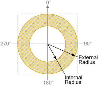
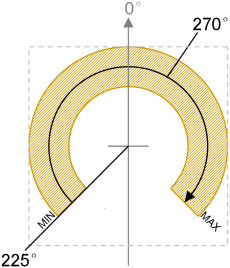
| *1. Definition of Radius and Angle | *2. example: Direction = Clockwise; Start Angle = 255°; Sweep Angle = 270 |
|
|
|---|
*3. Donut Mix Color Mode example
*4. Donut Discolor Mode example
Progress Bar (B16, B32)
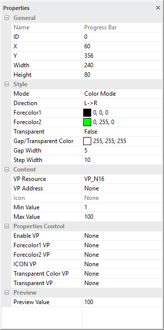
General
Show the basic information of the element
X and Y is the location of element on screen, reference point is element top-left corner
Width and Height are in pixels
top-left corner of the screen = 0,0
Style
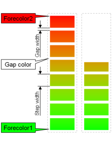
Mode options are
Color Mode, longer color bar could be show with a no. close to max (bar color could also be a mix of Forecolor1 & 2)
Icon Mode, Icon will move to the far end with a no. close to max
Fill Icon Mode, bar color could be replaced by an IMG_ICO
Direction options are
L->R / R->L / Up->Dn / Dn->Up
Forecolor1 Progress start color
Forecolor2 Progress end color
Transparent
False by default
True: enable transparent effect to show the IMG_ICO
Gap/Transparent Color function depends on mode selected
In Fill Color Mode, the selected color is gap color in the Progress Bar
In Icon Mode with Transparent Enabled, the selected color in the IMG_ICO will show as transparent.
(it is suggested to use pure color for transparent effect)(e.g. pure-magenta pure-black, pure-white, etc…)
Gap Width is in pixel for gap in the bar
Step Width is in pixel for the distance between gap
Content
VP Resource is the type of VP hold the content (VP_N16 by default)
VP Address is the VP that hold the value
Icon for Move Icon mode or Fill Icon mode
Min Value is the minimum Progress Bar value
Max Value is the maximum Progress Bar value
Properties Control (advance feature)
Enable VP is none by default (element operate normally)
Select a VP for real time element control. VP value will set to 1 as enable at power-on. It can be disabled (hidden) by a zero value
Foreground color1 VP is none by default (using the above selected color)
Select a VP for real time color change
VP value will copy the above selected color at power-on.
Foreground color2 VP is none by default (using the above selected color)
Select a VP for real time color change
VP value will copy the above selected color at power-on.
Transparent color VP is none by default (using the above selected color)
Select a VP for real time transparent color change
VP value will copy the above selected color at power-on.
Transparent VP is none by default (using the above option)
Select a VP for real time transparent background control VP value will copy the above transparent config at power-on. It can be enabled by a non-zero value or disable by a zero
ICON VP is none by default (using the above selected font)
Select a VP for real time change the IMG_ICO ID
VP value will copy the above ID at power-on.
Preview
Preview Value is only for displaying text in SGTools environment
note
*1. Progress Bar Operating Mode (Dn-->Up) Idea
| Color Mode
(100%, 60%) |
Fill Icon Mode
(100%, 60%) |
Icon Mode
(100%, 60%, 0%) | |
|---|---|---|---|
|
|||
Graph Element (G16)
General
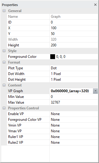
Show the basic information of the element
X and Y is the location of element on screen, reference point is element top-left corner
Width and Height are in pixels
top-left corner of the screen = 0,0
Style
Foreground Color is the color for of graph
Format
Plot Type options are
Dot, plot data as dot;
Line, plot data and link with line
Area, fill betwen plot and X-axis
Top Fill, fill between plot and Max Value
Bottom Fill, fill between plot and Min Value
Dot Width options are 1 / 2 / 3 / 4 pixels
(may resize the element width)
Dot Height options are 1 / 2 / 3 / 4 pixels
(may resize the element height)
Content
VP Graph select a VP_G16 array to be port on screen
Min Value is minimal graph potting value
Max Value is maximum graph potting value
Properties Control (advance feature)
Enable VP is none by default (element operate normally)
Select a VP for real time element control. VP value will set to 1 as enable at power-on. It can be disabled (hidden) by a zero value
Foreground color VP is none by default (using the above selected color)
Select a VP for real time color change
VP value will copy the above selected color at power-on.
Ymin VP is none by default (using the above selected color)
Select a VP for real time graph Min Value for Y scale zoom or pan
VP value will copy the above selected color at power-on.
Ymax VP is none by default (using the above selected color)
Select a VP for real time graph Max Value for Y scale zoom or pan
VP value will copy the above selected color at power-on.
Rule1 VP is none by default
Select a VP for real time horizontal line to be show in graph
Rule2 VP is none by default
Select a VP for another real time horizontal line to be show in graph
Bitmap Element (BP1)
General
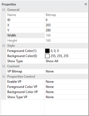
Show the basic information of the element
X and Y is the location of element on screen, reference point is element top-left corner
Width and Height are in pixels
top-left corner of the screen = 0,0
Style
Foreground Color(1) is the color for "1" bits
Background Color(0) is the color for "0" bits
Show Type options are
Show all (default) show all Foreground and Background Color
Show Foreground only show the "1" bits' color
Show Background only show the "0" bits' color
Content
VP Bitmap select a VP_BP1 array for the 1bpp graph data
Properties Control (advance feature)
Enable VP is none by default (element operate normally)
Select a VP for real time element control. VP value will set to 1 as enable at power-on. It can be disabled (hidden) by a zero value
Foreground color VP is none by default (using the above selected color)
Select a VP for real time color change
VP value will copy the above selected color at power-on.
Background color VP is none by default (using the above selected color)
Select a VP for real time color change
VP value will copy the above selected color at power-on.
Show Type VP is none by default (using the Show Type)
Select a VP for real time Show Type change
0(Show all) / 1(Show Foreground only) / 2(Show Background only)
VP value will copy the above selected Show Type at power-on
Round Clock (CLK_R)
General
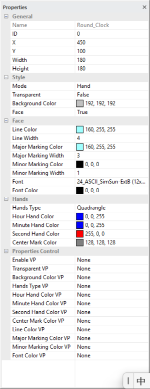
Show the basic information of the element
X and Y is the location of element on screen, reference point is element top-left corner
Width and Height are in pixels
top-left corner of the screen = 0,0
Style
Mode options are Hand /  Icon Rotation
Transparent False for showing clock face background color
Background Color clock face color
Face True for generate clock face and markings
Face
Line Color, Line Width are clock outer circle color and line width
Major Marking Color, Major Marking Width are clock hour mark color and line width
Minor Marking Color, Minor Marking Width are clock minutes mark color and line width
Font, Font Color are clock mark numbers font and color
Hands
Hands Type options are Line / Quadrangle / Trangle
Hour Hand Color, Minute Hand Color, Second Hand Color, Center Mark Color are color of hands and the color of its center
Properties Control (advance feature)
Enable VP is none by default (element operate normally)
Select a VP for real time element control. VP value will set to 1 as enable at power-on. It can be disabled (hidden) by a zero value
Transparent VP is none by default (using the above selected)
Select a VP for real time Transparent change (1=true, 0=false)
VP value will copy the above selected at power-on.
Hands Type is none by default (using the above selected)
Select a VP for real time hand config change
(0=Line, 1=Quadrangle, 2=TrangleHands)
VP value will copy the above selected at power-on.
Color VPs, is none by default (using the above selected color)
Select a VP for real time color change
VP value will copy the above selected at power-on.
QR Code Element (QRC)
General
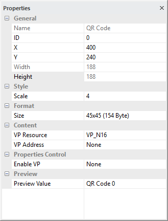
Show the basic information of the element
X and Y is the location of element on screen, reference point is element top-left corner
Width and Height are in pixels
top-left corner of the screen = 0,0
Style
Scale define the dot size of the QR code
Format
Size define matrix size and the capacity of the QR code

Content
VP Resource QR code need string data to be generate, VP_N16, VP_STR can be used
VP Address is the VP that hold the string
Properties Control (advance feature)
Enable VP is none by default (element operate normally)
Select a VP for real time element control. VP value will set to 1 as enable at power-on.
It can be disabled (hidden) by a zero value
Preview
Preview Value is only for displaying text in SGTools environment
Draw Pad (DPD)
General
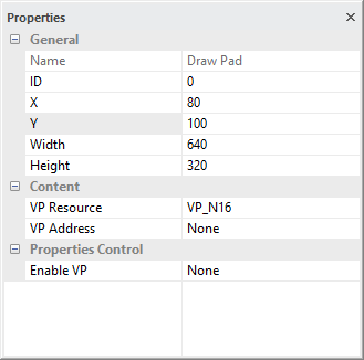
Show the basic information of the element
X and Y is the location of element on screen, reference point is element top-left corner
Width and Height are in pixels
top-left corner of the screen = 0,0
Content
VP Resource Draw Pad need a series of VP_N16 to draw
VP Address is the first VP that hold the draw code
Properties Control (advance feature)
Enable VP is none by default (element operate normally)
Select a VP for real time element control. VP value will set to 1 as enable at power-on.
It can be disabled (hidden) by a zero value

