Image Elements: Difference between revisions
From Smart LCD
Created page with "== Static Icon (ICO) == right 128x128px '''Style''' - Transparent = False by default True: enable transparent effect to show the IMG_ICO Auto: enable transparent effect and pick a high possible color as Transparent color - Transparent Color one color in the IMG_ICO could show as transparent. (it is suggested to use pure color for transparent effect) (e.g. pure-magenta pure-black, pure-white, etc…) '''Content''' - I..." |
|||
| (20 intermediate revisions by 2 users not shown) | |||
| Line 1: | Line 1: | ||
== Static Icon (ICO) == | == Static Icon (ICO) == | ||
[[File:ICO.png|128x128px]] | |||
[[File:Properties ICO.png|right]] | [[File:Properties ICO.png|right]] | ||
[[File: | '''General''' | ||
'''Style''' | Show the basic information of the element | ||
<u>X</u> and <u>Y</u> is the location of element on screen, reference point is element top-left corner | |||
<u>Width</u> and <u>Height</u> are in pixels | |||
top-left corner of the screen = 0,0 | |||
'''Style''' | |||
<u>Transparent</u> = False by default | |||
True: enable transparent effect to show the IMG_ICO | |||
Auto: enable transparent effect and pick a high possible color as Transparent color | |||
<u>Transparent Color</u> assign one color in the IMG_ICO that show as transparent | |||
suggested to use pure color for transparent effect (e.g. pure-magenta pure-black, pure-white, etc…) | |||
'''Content''' | |||
<u>Resources</u> option are Icons(default) / Icon Pack | |||
<u>Icon</u> select an IMG_ICO to be display | |||
<u>Mode</u> options are Normal (Width and Height auto adjust for IMG_ICO) / Resize (resize the image into the Width and Height) | |||
'''Properties Control (advance feature)''' | |||
<u>Enable VP</u> is none by default (element operate normally) | |||
Select a VP for real time element control. VP value will set to 1 as enable at power-on. It can be disabled (hidden) by a zero value | |||
<u>Icon Pack VP</u> is none by default (using the above selected one) | |||
Select a VP for real time Icon Pack change. VP value will copy the above IMG_ICO ID at power-on. | |||
<u>Icon VP</u> is none by default (using the above selected font) | |||
Select a VP for real time IMG_ICON change. VP value will copy the above IMG_ICO ID at power-on. | |||
<u>Transparent color VP</u> is none by default (using the above selected color) | |||
Select a VP for real time transparent color change. VP value will copy the above selected color at power-on. | |||
<u>Transparent VP</u> is none by default (using the above option) | |||
Select a VP for real time transparent background control. VP value will copy the above transparent config at power-on. | |||
It can be enabled by a non-zero value or disable by a zero | |||
== Animation Element (ANI) == | |||
[[File:ANI.png|128x128px]] | |||
[[File:Properties ANI.png|right]] | |||
'''General''' | |||
Show the basic information of the element | |||
<u>X</u> and <u>Y</u> is the location of element on screen, reference point is element top-left corner | |||
<u>Width</u> and <u>Height</u> are in pixels | |||
top-left corner of the screen = 0,0 | |||
'''Style''' | |||
<u>Transparent</u> = False by default | |||
True: filter out color defined in <u>Transparent Color</u>. | |||
<u>Transparent Color</u> color to be filtered out (show as transparent) in the selected <u>Animation</u> bitmaps. | |||
suggested to use pure color for transparent effect (e.g. pure-magenta pure-black, pure-white, etc…) | |||
- | '''Format''' | ||
<u>Loop-Play</u> = false by default, it will stop by showing the last bitmap in the animation. | |||
<u>Play Speed</u> = 100ms per frame by default | |||
[[File:ani-resource.jpg|right]] | |||
'''Content''' | |||
<u>Animation</u> select a group of bitmaps to be shown as animation, at design time. | |||
'''Properties Control (advance feature)''' | |||
<u>Enable VP</u> is none by default (Animation element is visible) | |||
Select a VP for run-time element control. VP value will be set to 1 as "visible" at power-on. Zero value in the selected VP will hide the element. | |||
<u>Animation VP</u> is none by default (using the bitmap group defined in <u>Animation</u>) | |||
Select a VP for run-time Animation element change. VP's stored value is the selected bitmap group's ID in Animations Resources (see picture on right) | |||
<u>Transparent color VP</u> is none by default (using the color defined at <u>Transparent Color</u>) | |||
Select a VP for run-time transparent color change. VP's stored value is the color code | |||
<u>Transparent VP</u> is none by default (using the above <u>Transparent</u> setting) | |||
Select a VP for run-time transparent Yes/No control. None-zero value in the selected VP enables transparent function. | |||
== Bit Icon (IDX_BIT) == | |||
[[File:IDX BIT.png|128x128px]][[File:Properties IDX BIT.png|right|578x578px]] | |||
'''General''' | |||
Show the basic information of the element | |||
<u>X</u> and <u>Y</u> is the location of element on screen, reference point is element top-left corner | |||
<u>Width</u> and <u>Height</u> are in pixels | |||
top-left corner of the screen = 0,0 | |||
'''Style''' | |||
<u>Transparent</u> = False by default | |||
True: enable transparent effect to show the IMG_ANI | |||
<u>Transparent Color</u> one color in the IMG_ANI could show as transparent. | |||
suggested to use pure color for transparent effect (e.g. pure-magenta pure-black, pure-white, etc…) | |||
( | '''Visual Effect''' | ||
Resources options are Icons / Icons Pack | |||
<u>Bit=1, Display</u> options are Show Icon / Show Cropped BgImg | |||
<u>Bit=1, Icon/BgImg</u> select a corresponding Icon or BgImg | |||
none by default (monitor bit content = 1; no icon to show) | |||
It can crop a box of a Background Image corresponding to the area. | |||
<u>Bit=0, Display</u> options are Show Icon / Show Cropped BgImg | |||
<u>Bit=0, Icon/BgImg</u> select a corresponding Icon or BgImg | |||
none by default (monitor bit content = 0; no icon to show) | |||
It can crop a box of a Background Image corresponding to the area. | |||
( | '''Content''' | ||
<u>VP Resource</u> options is the type of VP hold the content (VP_N16 by default) | |||
<u>VP Address</u> is the VP that hold a value | |||
<u>Bit Position</u> select a bit in the VP as monitor bit | |||
'''Properties Control (advance feature)''' | |||
<u>Enable VP</u> is none by default (element operate normally) | |||
Select a VP for real time element control. VP value will set to 1 as enable at power-on. It can be disabled (hidden) by a zero value | |||
<u>Icon Pack VP</u> is none by default (using the above selected one) | |||
Select a VP for real time Icon Pack change. VP value will copy the above IMG_ICO ID at power-on. | |||
<u>ICON_1_VP</u> is none by default (using the above selected font) | |||
Select a VP for real time change the IMG_ICO ID (monitor bit content = 1) VP value will copy the above ID at power-on. | |||
<u>ICON_0_VP</u> is none by default (using the above selected font) | |||
Select a VP for real time change the IMG_ICO ID (monitor bit content = 0) VP value will copy the above ID at power-on. | |||
<u>Transparent color VP</u> is none by default (using the above selected color) | |||
Select a VP for real time transparent color change. VP value will copy the above selected color at power-on. | |||
<u>Transparent VP</u> is none by default (using the above option) | |||
Select a VP for real time transparent background control. VP value will copy the above transparent config at power-on. | |||
It can be enabled by a non-zero value or disable by a zero | |||
''' | '''Preview''' | ||
<u>Preview Value</u> is only for displaying text in SGTools environment | |||
- | == Indexed Icon (IDX) == | ||
[[File:IDX.png|128x128px]] | |||
[[File:Properties IDX.png|right|514x514px]] | |||
'''General''' | |||
Show the basic information of the element | |||
<u>X</u> and <u>Y</u> is the location of element on screen, reference point is element top-left corner | |||
<u>Width</u> and <u>Height</u> are in pixels | |||
top-left corner of the screen = 0,0 | |||
'''Style''' | |||
<u>Transparent</u> = False by default | |||
True: enable transparent effect to show the IMG_ANI | |||
<u>Transparent Color</u> one color in the IMG_ANI could show as transparent. | |||
suggested to use pure color for transparent effect (e.g. pure-magenta pure-black, pure-white, etc…) | |||
''' | '''Content''' | ||
<u>VP Resource</u> is the type of VP hold the content (VP_N16 by default) | |||
<u>VP Address</u> is the VP that hold the value | |||
<u>Resources</u> option are Icons(default) / Icon Pack | |||
<u>First Icon</u> select the first IMG_ICO of a series of icons to be use and it will be display as Min Value | |||
<u>Min Value</u> is the value that link to the first of the IMG_ICO series | |||
<u>Max Value</u> is the value that link to the last of the IMG_ICO series | |||
'''Properties Control (advance feature)''' | |||
<u>Enable VP</u> is none by default (element operate normally) | |||
Select a VP for real time element control. VP value will set to 1 as enable at power-on. It can be disabled (hidden) by a zero value | |||
<u>Icon Pack VP</u> is none by default (using the above selected one) | |||
Select a VP for real time Icon Pack change. VP value will copy the above IMG_ICO ID at power-on. | |||
<u>Icon VP</u> is none by default (using the above selected font) | |||
Select a VP for real time IMG_ICON change. VP value will copy the above IMG_ICO ID at power-on. | |||
<u>Transparent color VP</u> is none by default (using the above selected color) | |||
Select a VP for real time transparent color change. VP value will copy the above selected color at power-on. | |||
<u>Transparent VP</u> is none by default (using the above option) | |||
Select a VP for real time transparent background control. VP value will copy the above transparent config at power-on. | |||
It can be enabled by a non-zero value or disable by a zero | |||
'''Preview''' | |||
<u>Preview Value</u> is only for displaying text in SGTools environment | |||
'''Note''' | |||
<nowiki>*</nowiki>1. Operation example | |||
[[File:IDX NOTE01.png|800x800px]] | |||
- | == Decimal Icon (I16, I32) == | ||
[[File:IDX DEC.png|128x128px]] | |||
[[File:Properties IDX DEC.png|right|682x682px]] | |||
'''General''' | |||
Show the basic information of the element | |||
<u>X</u> and <u>Y</u> is the location of element on screen, reference point is element top-left corner | |||
<u>Width</u> and <u>Height</u> are in pixels | |||
top-left corner of the screen = 0,0 | |||
'''Style''' | |||
<u>Transparent</u> = False by default | |||
True: enable transparent effect to show the IMG_ANI | |||
<u>Transparent Color</u> one color in the IMG_ANI could show as transparent. | |||
suggested to use pure color for transparent effect (e.g. pure-magenta pure-black, pure-white, etc…) | |||
'''Format''' | |||
<u>Align</u> options are Left / Right / Center | |||
<u>Integer Digits</u> is the no. of digit on left side of the dot (default Auto) | |||
<u>Decimal Digits</u> is the no of digit on right side of the dot | |||
'''Content''' | |||
<u>VP Resource</u> is the type of VP hold the content (VP_N16 by default) | |||
<u>VP Address</u> is the VP that hold the value | |||
<u>Resources</u> option are Icons(default) / Icon Pack | |||
<u>First Icon</u> select the first IMG_ICO of a series of icons to be use and it will be display as Min Value | |||
'''Content''' | |||
<u>VP Resource</u> is the type of VP hold the content (VP_N16 by default) | |||
<u>VP Address</u> is the VP that hold the value | |||
<u>First Icon</u> is the first IMG_ICO of a series of the icons which present as a zero | |||
VP | '''Advance''' | ||
<u>Compile As</u> can force VP variable work different than default (Auto); | |||
VP_N16 (two successive VP_N16) work as VP_N32 | |||
VP_N32 (first two byte of VP_N32) work as VP_N16 | |||
VP_N64 (first two byte of VP_N64) work as VP_N16 | |||
VP_N64 (first four byte of VP_N64) work as VP_N32 | |||
<u>Location pointer</u> is reserved, keep none for normal operation | |||
- Transparent VP is none by default (using the above option) | '''Properties Control (advance feature)''' | ||
<u>Enable VP</u> is none by default (element operate normally) | |||
Select a VP for real time element control. VP value will set to 1 as enable at power-on. It can be disabled (hidden) by a zero value | |||
<u>Icon Pack VP</u> is none by default (using the above selected one) | |||
Select a VP for real time Icon Pack change. VP value will copy the above IMG_ICO ID at power-on. | |||
<u>Icon VP</u> is none by default (using the above selected font) | |||
Select a VP for real time IMG_ICON change. VP value will copy the above IMG_ICO ID at power-on. | |||
<u>Transparent color VP</u> is none by default (using the above selected color) | |||
Select a VP for real time transparent color change. VP value will copy the above selected color at power-on. | |||
<u>Transparent VP</u> is none by default (using the above option) | |||
Select a VP for real time transparent background control. VP value will copy the above transparent config at power-on. | |||
It can be enabled by a non-zero value or disable by a zero | |||
<u>Decimal Digits_VP</u> is none by default (using the above option) | |||
Select a VP for real time no of decimal digit on right side of the dot. VP value will copy the above Decimal Digits at power-on. | |||
It can be enabled by a non-zero value or disable by a zero | |||
'''Preview''' | |||
<u>Preview Value</u> is only for displaying text in SGTools environment | |||
'''Note''' | |||
<nowiki>*</nowiki>1. Operation example | |||
[[File:IDX DEC NOTE01.png|800x800px]] | |||
Latest revision as of 14:53, 8 September 2025
Static Icon (ICO)
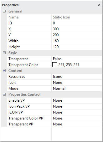
General
Show the basic information of the element
X and Y is the location of element on screen, reference point is element top-left corner
Width and Height are in pixels
top-left corner of the screen = 0,0
Style
Transparent = False by default
True: enable transparent effect to show the IMG_ICO
Auto: enable transparent effect and pick a high possible color as Transparent color
Transparent Color assign one color in the IMG_ICO that show as transparent
suggested to use pure color for transparent effect (e.g. pure-magenta pure-black, pure-white, etc…)
Content
Resources option are Icons(default) / Icon Pack
Icon select an IMG_ICO to be display
Mode options are Normal (Width and Height auto adjust for IMG_ICO) / Resize (resize the image into the Width and Height)
Properties Control (advance feature)
Enable VP is none by default (element operate normally)
Select a VP for real time element control. VP value will set to 1 as enable at power-on. It can be disabled (hidden) by a zero value
Icon Pack VP is none by default (using the above selected one)
Select a VP for real time Icon Pack change. VP value will copy the above IMG_ICO ID at power-on.
Icon VP is none by default (using the above selected font)
Select a VP for real time IMG_ICON change. VP value will copy the above IMG_ICO ID at power-on.
Transparent color VP is none by default (using the above selected color)
Select a VP for real time transparent color change. VP value will copy the above selected color at power-on.
Transparent VP is none by default (using the above option)
Select a VP for real time transparent background control. VP value will copy the above transparent config at power-on.
It can be enabled by a non-zero value or disable by a zero
Animation Element (ANI)
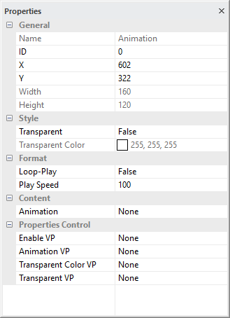
General
Show the basic information of the element
X and Y is the location of element on screen, reference point is element top-left corner
Width and Height are in pixels
top-left corner of the screen = 0,0
Style
Transparent = False by default
True: filter out color defined in Transparent Color.
Transparent Color color to be filtered out (show as transparent) in the selected Animation bitmaps.
suggested to use pure color for transparent effect (e.g. pure-magenta pure-black, pure-white, etc…)
Format
Loop-Play = false by default, it will stop by showing the last bitmap in the animation.
Play Speed = 100ms per frame by default
Content
Animation select a group of bitmaps to be shown as animation, at design time.
Properties Control (advance feature)
Enable VP is none by default (Animation element is visible)
Select a VP for run-time element control. VP value will be set to 1 as "visible" at power-on. Zero value in the selected VP will hide the element.
Animation VP is none by default (using the bitmap group defined in Animation)
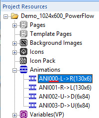
Select a VP for run-time Animation element change. VP's stored value is the selected bitmap group's ID in Animations Resources (see picture on right)
Transparent color VP is none by default (using the color defined at Transparent Color)
Select a VP for run-time transparent color change. VP's stored value is the color code
Transparent VP is none by default (using the above Transparent setting)
Select a VP for run-time transparent Yes/No control. None-zero value in the selected VP enables transparent function.
Bit Icon (IDX_BIT)
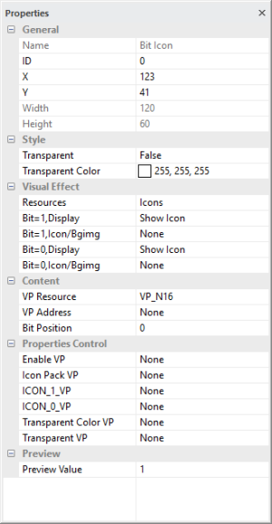
General
Show the basic information of the element
X and Y is the location of element on screen, reference point is element top-left corner
Width and Height are in pixels
top-left corner of the screen = 0,0
Style
Transparent = False by default
True: enable transparent effect to show the IMG_ANI
Transparent Color one color in the IMG_ANI could show as transparent.
suggested to use pure color for transparent effect (e.g. pure-magenta pure-black, pure-white, etc…)
Visual Effect
Resources options are Icons / Icons Pack
Bit=1, Display options are Show Icon / Show Cropped BgImg
Bit=1, Icon/BgImg select a corresponding Icon or BgImg
none by default (monitor bit content = 1; no icon to show)
It can crop a box of a Background Image corresponding to the area.
Bit=0, Display options are Show Icon / Show Cropped BgImg
Bit=0, Icon/BgImg select a corresponding Icon or BgImg
none by default (monitor bit content = 0; no icon to show)
It can crop a box of a Background Image corresponding to the area.
Content
VP Resource options is the type of VP hold the content (VP_N16 by default)
VP Address is the VP that hold a value
Bit Position select a bit in the VP as monitor bit
Properties Control (advance feature)
Enable VP is none by default (element operate normally)
Select a VP for real time element control. VP value will set to 1 as enable at power-on. It can be disabled (hidden) by a zero value
Icon Pack VP is none by default (using the above selected one)
Select a VP for real time Icon Pack change. VP value will copy the above IMG_ICO ID at power-on.
ICON_1_VP is none by default (using the above selected font)
Select a VP for real time change the IMG_ICO ID (monitor bit content = 1) VP value will copy the above ID at power-on.
ICON_0_VP is none by default (using the above selected font)
Select a VP for real time change the IMG_ICO ID (monitor bit content = 0) VP value will copy the above ID at power-on.
Transparent color VP is none by default (using the above selected color)
Select a VP for real time transparent color change. VP value will copy the above selected color at power-on.
Transparent VP is none by default (using the above option)
Select a VP for real time transparent background control. VP value will copy the above transparent config at power-on.
It can be enabled by a non-zero value or disable by a zero
Preview
Preview Value is only for displaying text in SGTools environment
Indexed Icon (IDX)
General
Show the basic information of the element
X and Y is the location of element on screen, reference point is element top-left corner
Width and Height are in pixels
top-left corner of the screen = 0,0
Style
Transparent = False by default
True: enable transparent effect to show the IMG_ANI
Transparent Color one color in the IMG_ANI could show as transparent.
suggested to use pure color for transparent effect (e.g. pure-magenta pure-black, pure-white, etc…)
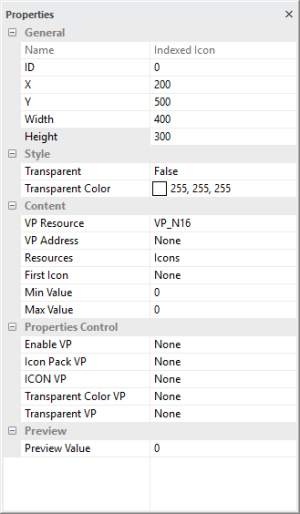
Content
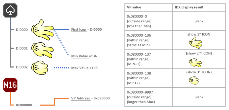
VP Resource is the type of VP hold the content (VP_N16 by default)
VP Address is the VP that hold the value
Resources option are Icons(default) / Icon Pack
First Icon select the first IMG_ICO of a series of icons to be use and it will be display as Min Value
Min Value is the value that link to the first of the IMG_ICO series
Max Value is the value that link to the last of the IMG_ICO series
Properties Control (advance feature)
Enable VP is none by default (element operate normally)
Select a VP for real time element control. VP value will set to 1 as enable at power-on. It can be disabled (hidden) by a zero value
Icon Pack VP is none by default (using the above selected one)
Select a VP for real time Icon Pack change. VP value will copy the above IMG_ICO ID at power-on.
Icon VP is none by default (using the above selected font)
Select a VP for real time IMG_ICON change. VP value will copy the above IMG_ICO ID at power-on.
Transparent color VP is none by default (using the above selected color)
Select a VP for real time transparent color change. VP value will copy the above selected color at power-on.
Transparent VP is none by default (using the above option)
Select a VP for real time transparent background control. VP value will copy the above transparent config at power-on.
It can be enabled by a non-zero value or disable by a zero
Preview
Preview Value is only for displaying text in SGTools environment
Note
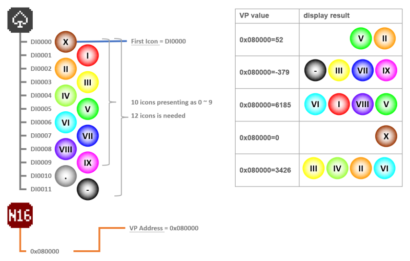
*1. Operation example
Decimal Icon (I16, I32)
General
Show the basic information of the element
X and Y is the location of element on screen, reference point is element top-left corner
Width and Height are in pixels
top-left corner of the screen = 0,0
Style
Transparent = False by default
True: enable transparent effect to show the IMG_ANI
Transparent Color one color in the IMG_ANI could show as transparent.
suggested to use pure color for transparent effect (e.g. pure-magenta pure-black, pure-white, etc…)
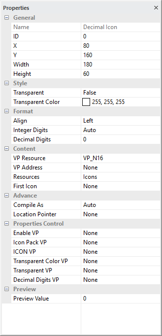
Format
Align options are Left / Right / Center
Integer Digits is the no. of digit on left side of the dot (default Auto)
Decimal Digits is the no of digit on right side of the dot
Content
VP Resource is the type of VP hold the content (VP_N16 by default)
VP Address is the VP that hold the value
Resources option are Icons(default) / Icon Pack
First Icon select the first IMG_ICO of a series of icons to be use and it will be display as Min Value
Content
VP Resource is the type of VP hold the content (VP_N16 by default)
VP Address is the VP that hold the value
First Icon is the first IMG_ICO of a series of the icons which present as a zero
Advance
Compile As can force VP variable work different than default (Auto);
VP_N16 (two successive VP_N16) work as VP_N32
VP_N32 (first two byte of VP_N32) work as VP_N16
VP_N64 (first two byte of VP_N64) work as VP_N16
VP_N64 (first four byte of VP_N64) work as VP_N32
Location pointer is reserved, keep none for normal operation
Properties Control (advance feature)
Enable VP is none by default (element operate normally)
Select a VP for real time element control. VP value will set to 1 as enable at power-on. It can be disabled (hidden) by a zero value
Icon Pack VP is none by default (using the above selected one)
Select a VP for real time Icon Pack change. VP value will copy the above IMG_ICO ID at power-on.
Icon VP is none by default (using the above selected font)
Select a VP for real time IMG_ICON change. VP value will copy the above IMG_ICO ID at power-on.
Transparent color VP is none by default (using the above selected color)
Select a VP for real time transparent color change. VP value will copy the above selected color at power-on.
Transparent VP is none by default (using the above option)
Select a VP for real time transparent background control. VP value will copy the above transparent config at power-on.
It can be enabled by a non-zero value or disable by a zero
Decimal Digits_VP is none by default (using the above option)
Select a VP for real time no of decimal digit on right side of the dot. VP value will copy the above Decimal Digits at power-on.
It can be enabled by a non-zero value or disable by a zero
Preview
Preview Value is only for displaying text in SGTools environment
Note
*1. Operation example
